
Imperfect
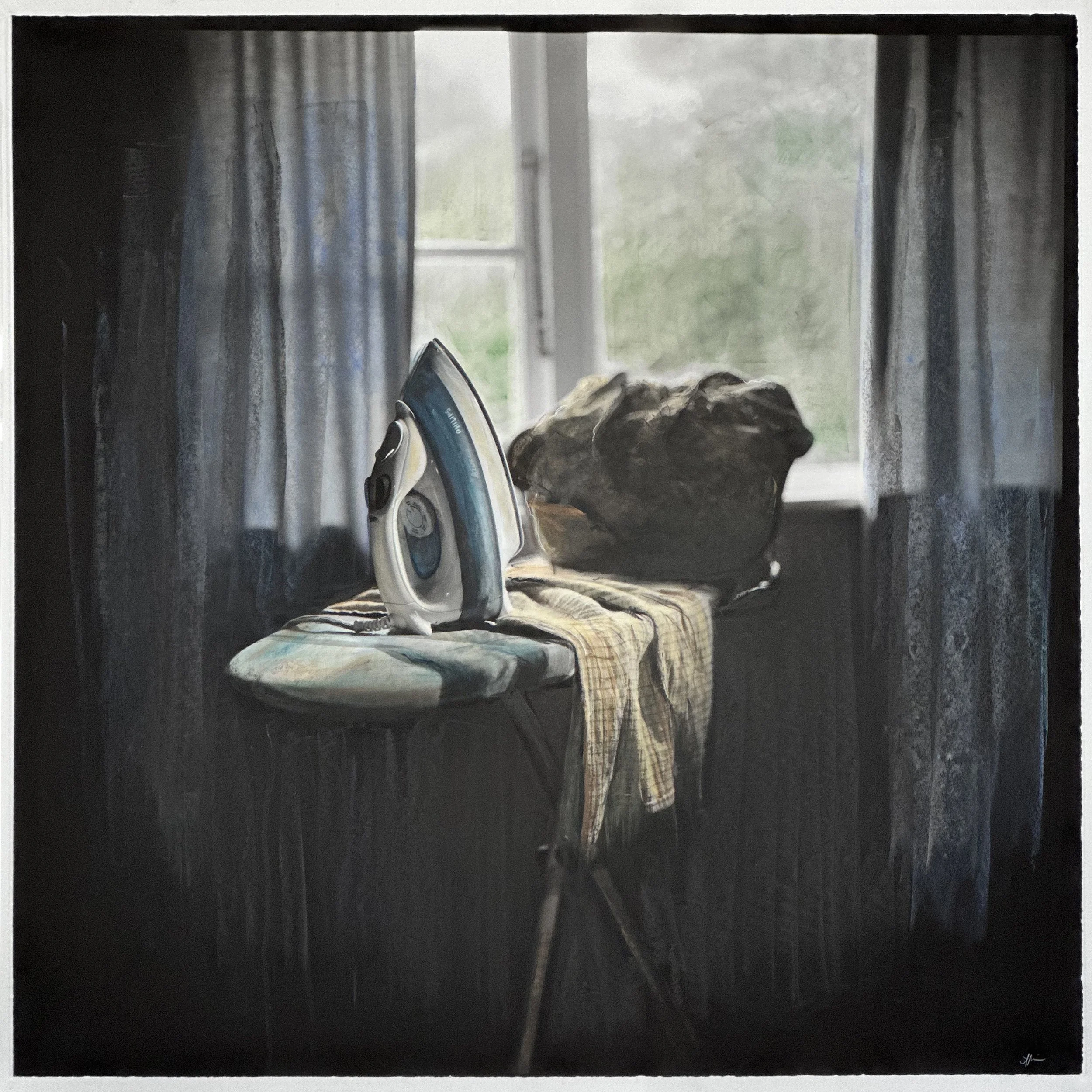
Tuesday, 2025. From A Week’s-worth of Devotion. Black and white pigment print, hand coloured with chalk pastel. 900mm x 900mm.
There’s nothing more potent for my creative potential than a deadline. Recently, a callout from the good folk of the Massey Photography shocked me out of my inertia and into making something new. Caroline McQuarrie and Shaun Waugh invited alumni of their programmes to submit pictures for an exhibition, held in honour of the half century the photography department has operated on the campus, and themed around analogue methodologies. They asked photographers to send in something they had already created, that was generated through a film based or camera-less practice. Now, I shot a fair bit of film in the last couple of years - predominantly black and white, with my Hasselblad 500c and its standard 80mm lens. But I didn’t have a print of anything that felt quite right to show on its own, or at least, nothing I felt excited to represent me in a massive salon-hang of nearly a hundred photography graduates. I decided to make something brand-spanking new, and to indulge an urge I’ve had to hand-colour black and white work using a medium I hadn’t experimented with before.
The series of images I photographed are small, staged domestic scenes, made in my house with the everyday things we use. There’s one image for each day of the week. For a few years I’ve been thinking a lot about the domestic labour of my maternal forbears, and this was always going to be something I made more pictures of. They’re a mixture of daylight and studio light, and they all carry the same stillness - as though the woman who did the labour has stepped out for a moment.
I am thankful to the good folk of Splendid who took care of developing the films, as the Massey darkroom facilities have all been in transit and I’m not set up for this kind of mahi at home. I’m still in the process of scanning the films in high resolution, (thanks to Joseph Kelly for facilitating the first two scans with his rare-as-hens-teeth Imacon Flextight scanner - he is truly a prince among men!). I’ve printed those two via the excellent fine-art printing service offered by Oliver Zavala. And then I got a little bit brave, and with my mum’s borrowed chalk pastels, I grazed and stroked and massaged colour into the surface of this first print. Tuesday.
My feminist leanings are showing - not just through the irony (get it?) of ironing tea towels, which I would personally never ever consider doing for real, but some of the women I am connected to have absolutely been known to do. I’m playing at being a little bit subversive through the act of colouring this work. Women have always had a place in the history of photography - the greats, like Julia Margaret Cameron and Margaret Bourke-White are two names I learned early in my career as intrepid souls, working in a largely male dominated field while standing out as extraordinary in their vision and craft. I’ve more recently learned about a plethora of talented women working in New Zealand as photographers, professionally and personally, through Lissa Mitchell’s beautiful and richly detailed book, Through Shaded Glass. If you want to learn about the remarkable, way-paving women who were typically less visible as practitioners than their male counterparts, (in spite of their contributions to both the development of photography and the historic record), you can do no better than a study of that book. For many women, however, the entry into a photographic profession was frequently via lesser, supporting roles in a studio where men were the heroic and technically skilled photographers, and women made their productions possible through administration and hand-craft.
Work as a colourist provided an opportunity for a woman to work legitimately as an artist. I recently watched a short documentary on Loading Docs Film Festival website about the colourists of New Zealand’s own Whites Aviation. Directed by Greg Wood and Peter Alsop, The Colourist honours the work of Grace Rawson, an employee of Whites in the Fifties. Her role was as one of the team of women who hand-tinted each of the Whites Aotearoa vistas. I grew up with one of the Whites pictures of Queenstown hanging on my Nanna’s wall. I presume it was an original hand coloured photograph, as they’d had it there in pride of place as long as I can remember. I think it hangs at my aunt’s house now. A few years ago I saw the same photograph reproduced in various merchandise, including one printed on a clock face, and for sale at Te Papa’s gift shop. I had to have it. Now Nanna’s Whites Aviation Queenstown picture hangs, not in it’s fully realised splendour, but cropped into a tight circle that tells us the time in our own dining room.
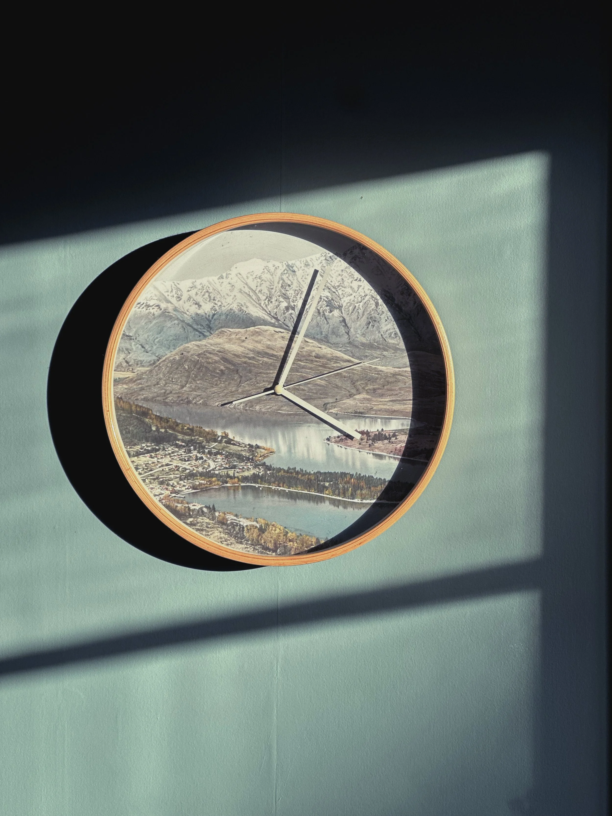
Our Queenstown clock, just like it’s been plucked from my memory of Nanna’s living room.
I’m a fan of analogue processes, and I’m aware of it as something very very different to the 9-5 kind of work I normally earn money doing, making photographs for my clients. The principles are the same - light hits a sensitised surface inside the camera and forms a two dimensional reproduction of the world it bounced off in the first place. That’s the same whether it’s on film, a glass plate, or a digital sensor. I think when people talk about loving film, they’re really talking about the inherent, beautiful imperfections that arise from physical media. If somebody wants to ape a film photograph by applying a filter to a digitally generated image, the filter that’s applied generally is an affectation of the imperfections of film, namely in visible silver grain, a softness of tonal transition, and things like light leaks and colour cast. I get it, I love that feeling of anything hand-made, and the clinical precision of my digital photographs is often something I attempt to undermine with whatever methods I can apply in-studio or on location. But they’re still doing the same fundamental job of showing us the world that was in front of the lens. Where it becomes even more interesting for me is in the choices made before and after the camera does its thing. I decide where light is allowed to be, or when to train my camera on the light that is in a place. That choice is made regardless of my medium. I make choices about the glass I use to shoot through, and what I’m including in the frame. I arrange the shapes to place emphasis where I wish, and allow the edges to slice through the world where I deem inclusion unnecessary. And then after the shutter is depressed, I have a host of other choices at my disposal.
The thing I most enjoy about using film is the physicality of the act of loading and winding and firing the shutter. That’s a buzz every single time. But it’s also the physicality of what is created. My day job makes a lot of pictures that are most frequently seen on a digital screen, - sometimes on a bus or billboard, but most of the pictures I take for clients are never printed. With analogue photography, there’s always a physical output, even if the result is only legible in a digital scan of the negative. When printing in the darkroom, many of the same choices are available as when I work on a digital file - I can crop, dodge and burn and darken the edges. I can increase and decrease contrast. Later, I can remove spots. However, I can’t make black and white film faithfully return to the colour it first saw. And that’s where the magic is. The colours I might add to a black and white analogue photograph are entirely my choice. How and where and what is all about what I want to draw attention to, and ultimately, how I want my gesture to impact the surface of the image.
I won’t lie. I was quite scared about colouring this print. I hadn’t done something like this in more years than I care to admit, and the cost of the print was still basically a hundred dollars. I’m not printing it again just because I messed it up, so there’s a bit riding on the steadiness of my hand, and the choices I make for colour. When I was the first few strokes of pastel in, the sweat was beading on my nose, and I had to have a moment to collect myself. However, it wasn’t long before I began to really enjoy the tactility of this work. As I layered colours on top of each other, I became more cavalier, and by the end, I was confidently swiping great ribbons of colour through the composition. The hardest thing, in the end, was knowing when to stop.
It’s the first, I think of many. I loved doing this with my whole heart. I don’t even care if nobody ever asks to see another one. This was pure joy, almost as good as the delicious mechanical thunk that happens when I take a picture with the camera that made the image. It’s likely that as I develop, I’ll get looser with my use of colour, with broad getural strokes of whatever media I’ve chosen, because precision isn’t what I actually seek. I’m dialling up the imperfections, which might be welcome news to some of the people who advocate for me.
If you’d like to see my big roughly coloured print on a wall, you have a couple of weeks left to view it at The Engine Room at Massey University, amongst a plethora of other wonderful photographic works.
https://www.massey.ac.nz/about/events/analogue-n-photography-exhibition/
If you want to watch that very short doco, you can go here: